CJC Brand Resources
Templates, guides, resources and more can be found in the UF Brand Center https://brandcenter.ufl.edu/
Our brand is what potential and current students, faculty, alumni, and industry professionals all think, feel and respond to when they hear the University of Florida College of Journalism and Communications mentioned. These assets are provided to support faculty, staff and students in the telling of our College’s brand story and identity.
Logos
Please use the official UF College of Journalism and Communications logo unless you have an approved secondary logo for your department, division, center, or unit. Do not alter this logo in any way, such as distorting the dimensions, cropping, or adding/deleting text. When creating assets for your department, division, center or unit for audiences outside of UF, please ensure that you primarily use the university and college logos as outlined in the UF Brand Center.
Powerpoint Templates
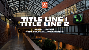
There are two styles of PowerPoint templates to choose from. Each style has an orange and a blue version. If you need a fast and easy template, choose the “minimalistic” template. If you want a bit more “wow” in your presentation, choose the “CJC” template. This template includes more options for text and photo layouts. Both presentation templates come with a graph/chart section to input data, too.
Canva Templates
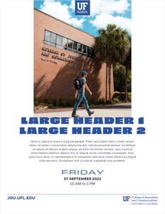
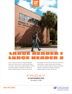
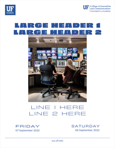
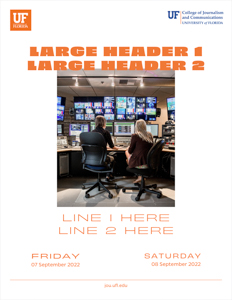
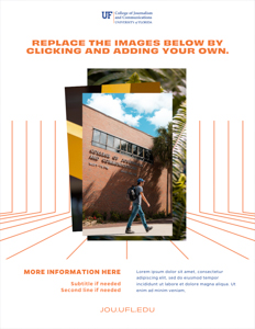
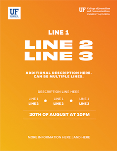
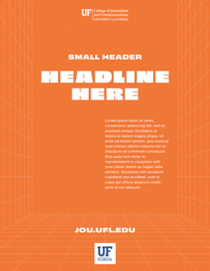
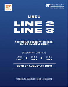
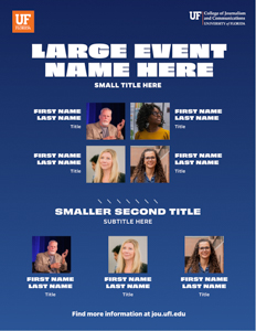
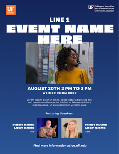
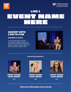
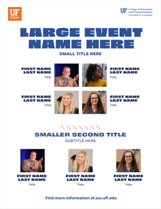
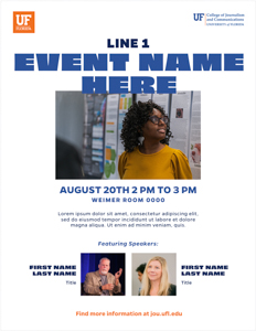
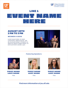
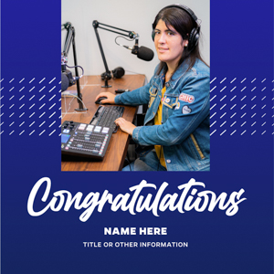
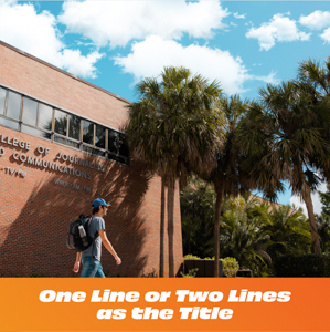
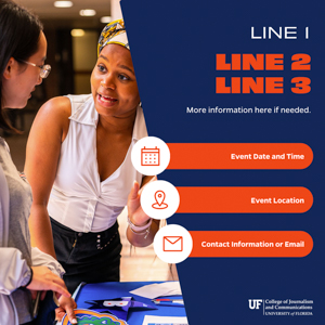
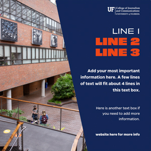
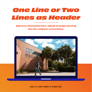
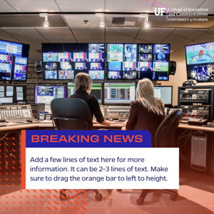
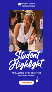
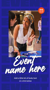
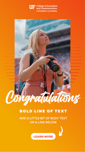
These Canva templates allow you to customize your own designs. Each template is populated with the approved UF branding including the fonts, colors, and design elements. The templates below include square posts, vertical stories, and flyers.
To access the Canva template, click on the photo icon. When editing the design with your own copy and photographs, please do not use any colors or fonts that are not in the UF brand. You are not required to have the UF fonts downloaded to your machine because Canva will have these fonts housed within. New templates will be uploaded periodically, so check back to see new designs.
If you would like to share your thoughts or recommend an idea for another template, please contact Jen Ford.
Flyers (8.5 inches by 11 inches)
Square Posts (1080 pixels by 1080 pixels)
Vertical Stories (1080 pixels by 1920 pixels)
Social Media
Follow the College’s primary social media accounts @ufjschool.
Social media accounts require planning, resources, and collaboration, as well as knowledge of accessibility requirements and UF rules and regulations. All official CJC social media accounts will require approval from the CJC Communications Department and the Dean. Please fill out this form or contact Jen Ford at jennifer.ford@ufl.edu to register any new or existing social media accounts.
All accounts must follow the UF Social Media Guidelines.
Accessibility and Social Media
Social media is an important tool for sharing information. When social media is used by the College’s students, employees and/or public to carry out or participate in its core educational and administrative activities, all available accessibility-supported features of the platform should be used whenever possible.
Provide Alternative Text Descriptions for Images
When social media platforms allow for alternative text descriptions on images, you should provide them. Text descriptions of images will be read aloud to non-sighted or low-sighted users who rely on screen readers to consume social media content.
Provide live captions or post-production captioning of videos
Accurate captions are required by the Americans With Disabilities Act on video content on any platform. Captions can be either closed captions (where a user can turn them on and off) or open captions (where the text is embedded into the video and cannot be turned on or off). Check the social media platform’s accessibility support features to determine which captioning type (closed or open) must be employed for captions to appear when a video plays.
Avoid GIFs or Post Context for Animated GIFs
The animated GIF format has either very limited or no accessibility support on most social media platforms. This makes the animated GIF content difficult for individuals who rely on screen readers to perceive. Therefore, you should not rely solely on animated GIF content in a social media post. When using animated GIFs, confirm that the post can be understood through its text content alone.
Use CamelCase Hashtags
Hashtags are an important component of social media posts. When using hashtags made up of multiple words, use initial capitalization, also known as CamelCase. Using this simple technique makes the hashtag easier to read for all users and is more consumable by screen readers since their synthesized voices can recognize and pronounce individual words, and won’t garble them. #CommuniGators
Limit Emojis and Emoticons
Emojis displayed on a screen will be described by a screen reader. The 😊 emoji, for example, will be read aloud as “smiling face with smiling eyes.” Please consider screen reader users by using emojis sparingly and by placing spaces between them. You can also put emojis after a URL at the end of a post on Twitter to prevent Twitter from trimming the URL.
Creating emoticons with text should be avoided. In this example, this visual experience of “shruggie” ¯\_(ツ)_/¯ will be read aloud by a screen reader as: “Macron, backslash, underline, katakana, underline, slash, macron.
Some additional accessibility resources:
- https://digital.gov/resources/federal-social-media-accessibility-toolkit-hackpad/
- https://www.afb.org/consulting/afb-accessibility-resources/afbs-social-media-accessibility-standards
- Guidelines for Digital Image descriptions
- Color Blindness Simulator
- https://www.linkedin.com/pulse/accessibility-matters-alexa-heinrich/
- A Student-Focused Toolkit
- Life of a Blind Girl Guide
- Understanding Accessibility on Social Media
Questions?
Please email jennifer.ford@ufl.edu or communication@jou.ufl.edu.


